How to Use Color Theory in AI Art for Better Results
Learn how to use color theory principles to enhance your AI-generated artwork.
The Psychology of Color: Applying Traditional Color Theory to AI Art
Color is one of the most powerful tools in visual communication, capable of evoking emotions, directing attention, and creating aesthetic harmony or tension. While AI can generate beautiful colors automatically, understanding color theory allows you to direct AI tools with precision and intention, creating artwork that communicates effectively and resonates emotionally with viewers.
Fundamental Color Relationships in Digital Art
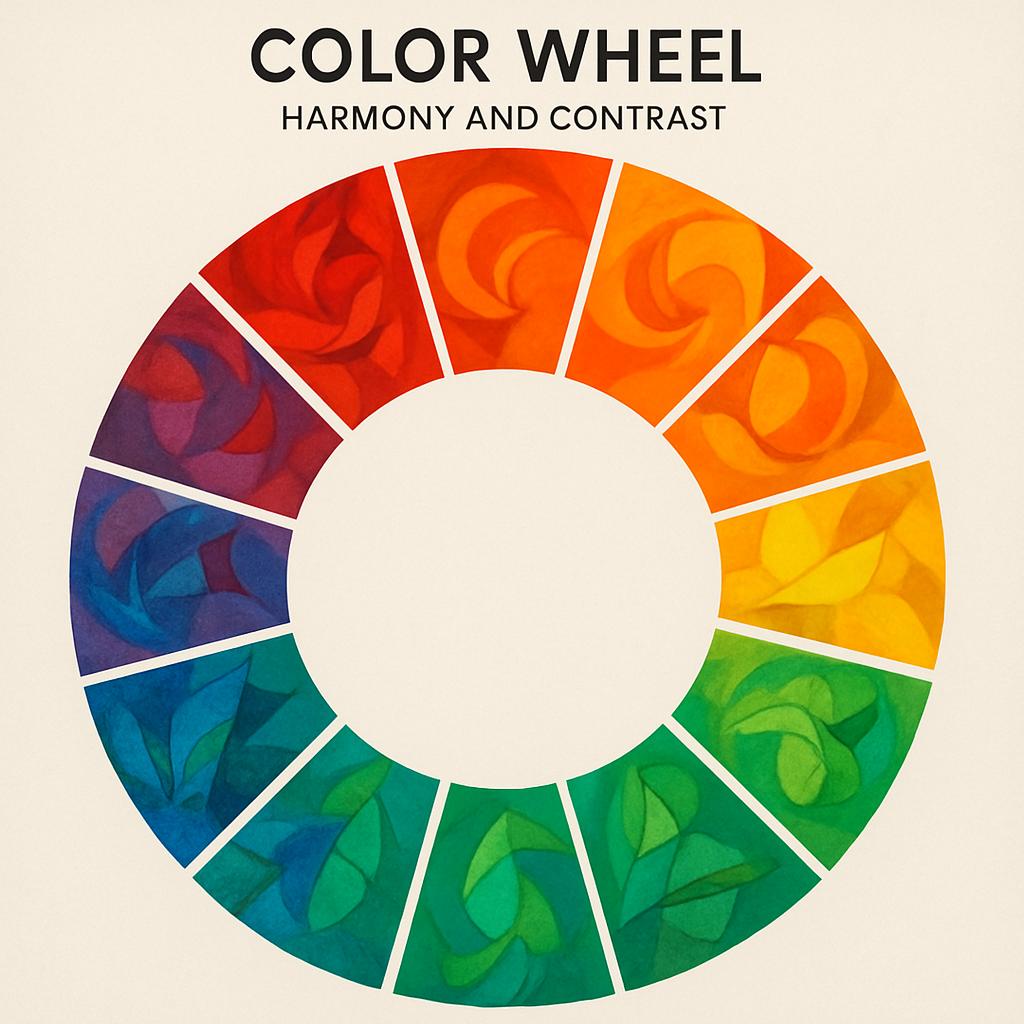
 Traditional color theory provides a foundation for understanding how colors interact, complement, and
influence each other. These principles remain relevant in AI art generation, where understanding color
relationships helps you create more intentional and effective prompts that guide AI systems toward
harmonious and impactful color choices.
Traditional color theory provides a foundation for understanding how colors interact, complement, and
influence each other. These principles remain relevant in AI art generation, where understanding color
relationships helps you create more intentional and effective prompts that guide AI systems toward
harmonious and impactful color choices.
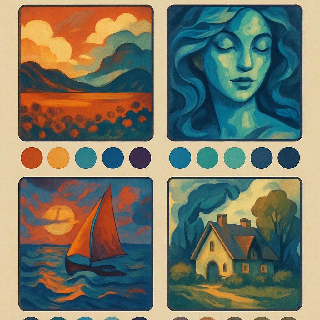
Complementary colors create dynamic tension and visual excitement, making subjects appear more vibrant and eye-catching. When prompting AI systems, specifying complementary color relationships can create images with strong visual impact and clear focal points. This is particularly effective for portraits, product photography, and artwork intended to grab attention.
Analogous color schemes create harmony and cohesion, producing images that feel peaceful and unified. These color relationships work particularly well for landscapes, mood pieces, and artwork intended to create specific atmospheric effects. AI models respond well to analogous color descriptions when creating cohesive, professional-looking imagery.
Triadic and tetradic color schemes offer more complex relationships that can create sophisticated and visually interesting compositions. These advanced color harmonies require more careful balance but can produce distinctive and memorable artwork when applied thoughtfully through AI generation.
Color Theory Principle:
Colors don't exist in isolation – they're always perceived in relationship to surrounding colors. Understanding these relationships allows you to predict and control how viewers will perceive and respond to your AI-generated artwork.
Emotional and Psychological Impact of Color
Colors carry deep psychological and cultural associations that influence how viewers interpret and respond to visual content. Understanding these associations allows you to use color strategically in AI art generation to evoke specific moods, communicate particular messages, and create desired emotional responses in your audience.
Warm colors (reds, oranges, yellows) generally evoke energy, warmth, and excitement. They tend to advance visually, making objects appear closer and more prominent. In AI art generation, warm color palettes work well for dynamic scenes, portraits meant to convey energy or passion, and artwork intended to feel inviting or stimulating.
Cool colors (blues, greens, purples) typically create feelings of calm, tranquility, and professionalism. They tend to recede visually, creating sense of depth and space. Cool palettes are excellent for landscapes, corporate imagery, and artwork intended to convey reliability, peace, or sophistication.
Color temperature mixing allows for more nuanced emotional communication, combining warm and cool elements to create complex moods and visual interests. Understanding how to describe these temperature relationships to AI systems enables more sophisticated emotional direction in generated artwork.
Warm Color Psychology
- • Red: Energy, passion, urgency, power
- • Orange: Enthusiasm, creativity, warmth, friendliness
- • Yellow: Optimism, clarity, intellectual energy, caution
- • Application: Dynamic scenes, food, entertainment, children
Cool Color Psychology
- • Blue: Trust, stability, professionalism, calm
- • Green: Growth, harmony, nature, balance
- • Purple: Luxury, creativity, spirituality, mystery
- • Application: Corporate, healthcare, technology, nature
Advanced Color Harmony Techniques
 Professional color application goes beyond basic color wheel relationships to include sophisticated
techniques for creating visual hierarchy, directing attention, and achieving specific aesthetic goals.
These advanced approaches can be effectively communicated to AI systems through precise color terminology
and strategic prompt construction.
Professional color application goes beyond basic color wheel relationships to include sophisticated
techniques for creating visual hierarchy, directing attention, and achieving specific aesthetic goals.
These advanced approaches can be effectively communicated to AI systems through precise color terminology
and strategic prompt construction.
Saturation control allows for subtle mood manipulation and visual hierarchy creation. High saturation creates energy and demands attention, while desaturated colors create sophistication and allow other elements to dominate. Understanding how to specify saturation levels in AI prompts enables fine control over visual emphasis and emotional tone.
Value relationships (light and dark) often matter more than specific hue choices for creating successful compositions. Understanding how to describe tonal relationships to AI systems helps create images with strong compositional structure and clear visual hierarchy, regardless of the specific colors used.
Color temperature gradients can create depth, atmosphere, and sophisticated visual interest. Describing how color temperature should shift across an image – from warm foregrounds to cool backgrounds, for example – helps AI systems generate images with professional-quality atmospheric perspective and depth.
Accent color strategies involve using small amounts of contrasting color to create focal points and visual interest within predominantly monochromatic or limited palette compositions. This technique requires understanding how to specify color distribution and emphasis in AI prompts effectively.
- Monochromatic schemes with strategic saturation variation for sophisticated unity
- Split-complementary approaches for dynamic harmony without harsh contrast
- Color temperature progression for atmospheric depth and visual flow
- Accent color placement for focal point creation and visual hierarchy
- Neutral color integration for balance and sophisticated palette development
- Cultural color associations for targeted audience communication
Cultural and Contextual Color Considerations
Color meanings and associations vary significantly across cultures, historical periods, and contextual applications. Understanding these variations helps create AI art that communicates effectively with intended audiences while avoiding unintentional cultural misunderstandings or inappropriate associations.
Western color associations often differ significantly from those in Eastern cultures. Red signifies luck and prosperity in Chinese culture but can indicate danger or warning in Western contexts. Understanding these differences helps create culturally appropriate and effective color choices when generating art for specific audiences or markets.
Historical color associations change over time and can affect how contemporary audiences interpret artwork. Colors that signified wealth or status in historical periods may carry different meanings today. When creating historically-inspired AI art, understanding period-appropriate color use enhances authenticity and cultural accuracy.
Industry and context-specific color conventions affect how colors are perceived in different applications. Healthcare environments favor certain colors for psychological comfort, while technology brands use different palettes to convey innovation and reliability. Understanding these conventions helps create appropriate AI art for specific professional contexts.
Gender and age-related color preferences, while often overgeneralized, do influence audience response and market effectiveness. Understanding these tendencies helps create AI art that resonates with intended demographics while avoiding stereotypical or limiting approaches to color selection and application.
Technical Color Implementation in AI Systems
Different AI models handle color information differently, and understanding these technical aspects helps achieve more predictable and professional results. This includes understanding color space limitations, how models interpret color terminology, and techniques for achieving specific color outcomes consistently across different generation sessions.
Color space considerations affect how accurately AI systems can reproduce intended colors and how those colors will appear in different output contexts. Understanding the relationship between color description, AI interpretation, and final output helps set realistic expectations and choose appropriate prompting strategies.
Prompt specificity for color control requires understanding which color terms AI models recognize and respond to most effectively. Some models respond better to technical color descriptions (HSB values, Pantone references) while others work better with descriptive language (warm golden yellow, deep forest green).
Consistency control across multiple generations becomes important for professional applications where color matching is critical. Understanding how to maintain color consistency while still allowing for creative variation requires systematic approaches to prompt construction and generation parameters.
Post-processing integration with AI generation workflows allows for color refinement and adjustment after initial generation. Understanding how AI-generated colors respond to traditional color correction techniques helps create complete workflows that combine AI efficiency with professional color control standards.
Technical Tip:
Different AI models interpret color terminology differently. Test your color descriptions with small generations first to understand how specific models translate your color intent into visual results before committing to large or important projects.
Color Accessibility and Inclusive Design
Creating AI art that is accessible to viewers with different types of color vision requires understanding color blindness, contrast requirements, and inclusive design principles. This consideration is particularly important for commercial applications, educational content, and public-facing artwork where broad accessibility is essential.
Color blindness affects approximately 8% of men and 0.5% of women, with red-green color blindness being the most common form. Understanding how different types of color vision affect perception helps create AI art that communicates effectively regardless of viewer's color vision capabilities.
Contrast requirements for accessibility ensure that important information remains visible and legible for viewers with various visual capabilities. When generating AI art with text elements or important visual hierarchies, understanding contrast requirements helps create more universally accessible content.
Alternative visual cues beyond color help ensure that important information is communicated through multiple channels. This might involve using texture, pattern, position, or size variations in addition to color differences to convey information and create visual hierarchy.
- High contrast ratios for text and important visual elements
- Color combinations that remain distinct for common color vision variations
- Multiple visual cues beyond color for important information
- Testing with color blindness simulation tools for validation
- Pattern and texture integration for enhanced accessibility
- Cultural sensitivity in color choice and application
Professional Color Workflow Development
Developing systematic approaches to color in AI art creation improves consistency, efficiency, and professional quality. This involves creating color libraries, developing prompting templates, and establishing quality control procedures that ensure color choices serve creative and communication goals effectively.
Color palette development for specific projects or clients requires understanding brand guidelines, audience preferences, and contextual requirements. Creating systematic approaches to palette development helps ensure that AI-generated artwork maintains consistency and professional standards across multiple pieces and applications.
Documentation and repeatability become important for professional applications where color consistency is critical. Understanding how to document successful color approaches and recreate them reliably across different AI generation sessions helps maintain professional standards and client satisfaction.
Client communication about color requires translating aesthetic preferences and brand requirements into effective AI prompts while managing expectations about color accuracy and variation in AI-generated content. Developing clear communication strategies helps ensure successful color outcomes that meet professional requirements.
Mastering Color as Creative Communication
Color theory in AI art represents the intersection of traditional artistic knowledge with cutting-edge technology. Understanding both domains allows you to create artwork that combines the efficiency and creativity of AI generation with the intentionality and effectiveness of professional color application.
The most successful AI artists understand color not just as aesthetic decoration but as a powerful communication tool that affects viewer perception, emotional response, and behavioral engagement. This understanding transforms color from accidental byproduct to intentional creative strategy.
Color Mastery Development Plan:
- Study traditional color theory fundamentals and their psychological effects
- Experiment with different color descriptions in AI prompts systematically
- Analyze successful artwork to understand effective color application
- Develop personal color libraries and prompting templates
- Practice cultural and contextual color considerations
- Build workflows that combine AI efficiency with color precision
Remember that color knowledge serves creative vision rather than replacing it. The most compelling AI art emerges when technical color understanding supports authentic creative expression and clear communication goals rather than simply demonstrating technical capability.
Ready to harness the full power of color in your AI art? Start by understanding your specific communication goals, study how color serves those goals in successful artwork, and experiment systematically with different color approaches to develop your personal color vocabulary and aesthetic signature.
Try It Yourself!
Ready to put these insights into practice? Start creating amazing AI artwork today.
Related Articles
What Are the Top AI Art Trends in 2024? (With Examples)
Discover the latest trends in AI-generated artwork that are shaping the digital art landscape this year.
How AI Is Transforming the Future of Digital Art
Explore how artificial intelligence is fundamentally changing the creative landscape and what it means for artists.